A heads up: I think I was having a slight manic episode while typing this rant.
Gahd, I feel like such a dork when I geek out on fonts, but I'm so into them! I'm also very opinionated about them. For instance, look at our options for fonts on this board. They're your typical web-standard fonts, which Microsoft established back in... 1996, I think? Boy, they screwed that one up BAD. Really? Arial? Comic Sans? REALLY?
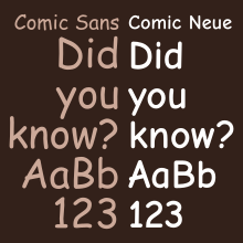
I understand Comic Sans had its place in the 90's for its remarkable readability in aliased text, but that time has passed. Something needs to be done about its place as a web-standard font. I mean, the whole series needs an overhaul, but we can start with Comic Sans and Arial. And Helvetica isn't even on the list? How is Helvetica, the world's most ubiquitous typeface, not among the set of web-standard fonts? Arial was designed by Microsoft in... 1983? It was made to be a Helvetica clone -- a knock-off, that they could freely package with their operating system without paying a royalty. But here's the thing: EVERYBODY has Helvetica on their device, whether it be their computer, laptop, phone, anything but a Speak & Spell.
To me, Arial is to Helvetica what
Without a Paddle is to
The Goonies. Or to put it a better way, it's to Helvetica what Windows is to the Macintosh. It's a banal, derivative, me-too product, bastardized just enough from the original to avoid a trademark or copyright suit.
It seems like a case of Microsoft imposing their megalomaniacal ego, rather than any exercise in taste, but that's just my opinion.
Gah, I hate the way the S, C, and lower-case e and j are cut. The only reason they chose that angle, is so it's not quite Helvetica.
There's a better option to Comic Sans. Enter Comic Neue. It takes the things that are likeable about Comic Sans and fixes the things that are bothersome. And it's a completely free font! This should be an obvious web fix.
One of our awesome skateshops here in Philly, Nocturnal, uses Arial for their logo, but they use it in a creative way. The admittedly bad font is emboldened and squashed vertically, and the kearning is reduced so the letters overlap one another. Distorting a bastard font makes it cool, and it's a good look for a skateshop.

Are you still with me? I'm done being a Negative Nancy. From here on out, I want to be a Positive Penelope.
Geometric fonts: Century Gothic, Nobel, and Futura. Ooooohhhhh, do I love these three! I've always had a thing for geometric proportions, and these fonts do it for me. Especially Century Gothic and Nobel. I just LOVE the way the C and G are cut! And the way everything is based on circles; it's just so damn elegant! And the lower-case a! I love, love, LOVE that it's drawn the way people tend to write it!
With such better options available for free, why are we still using these tasteless fonts? Some of the best typefaces were designed as far back as the 1920's, and we're using these? We can do better. Let's replace Arial with Helvetica. Substitute Comic Neue for Comic Sans. Keep Times New Roman, but maybe include the option of my personal favorite serif font, Palatino.
I don't know. There's a lot about the politics of typefaces that I don't know. I'm just an enthusiastic novice.
Go font yourself.

